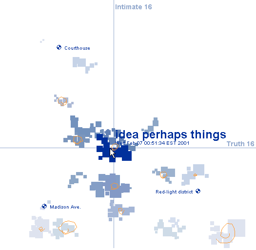
Creating an alternative map on Google Earth was likely the most productive and personal project for me that we have done this semester. I enjoyed being able to produce a navigable online space of what is truely my home in the world that can be accessed and perused by other students at the college, as well as my friends and family members. The tools that Google Earth provides allowed me to fully customize the map that it would reflect the unique narrative and exploration I wanted to provide for viewers (even if I was unaware of some of the tool that could have potentially enhanced this personalized and directed view of campus at the time of making the map.)
After transfering to St. Mary's, the campus has been the one place on Earth I can truely call home at this point in my life, and there are a number of spaces that hold memories and emotions for me that are not reflected in the actual environment. It was fulfilling to be able to locate and present my memories in a visual way on a space that reflected the reality of the geography of campus as a means of digitally imprinting my impact onto this campus. I was also particuarilly thrilled to see how my own experiences and places of importance overlapped with the sites chosen by other students in the class - it allowed me to more fully realize the history and presence each site on campus has that cannot be realized in merely viewing photographs or looking at the spaces from afar.
Google Earth does have its limits, but I appreciate the online interactive aspect of the maps that we created for this project. Rather than only having my own experiences imprinted onto the space, Google Earth provides a venue through which spaces and projects can be overlapped in order to showcases the enormity of influence this environment has that cannot simply be represented on a state or governmental map.
Monday, May 11, 2009
Artist Category Week 13: The Walker Sculpture Garden


The Walker Sculpture Garden, 1998
The Walker Sculpture Garden is an interactive map run through Cosmo Player that provides a virtual reality tour through the VRML Minneapolis Sculpture Garden. Viewers move through garden pathways where they will encounter icons that leads them to further information and images of the sculptures in the garden. The project was designed to be an exploration of the possibilities of Web-based 3D environments.
This project seems to mirror many of the function of Google Earth that we utilized for a our final alternative mapping project. The site presents a digital space mapped out to represent an actual environment in nature. As we added icons or small tacks into our Google Earth map, the Walker Sculpture Garden makes use of the above icons to identify for users areas of interest that can be explored more thoroughly. Like the placemarks of Google Earth, these icons can be clicked on to bring up information in the form of text that describe the sculptures as well pictures and other media that allow viewer to interact and engage with the visual aspects of the pieces.
This project seems like an interesting and difficult endeavor due to the three dimensional nature of sculptures. It is one thing to provide what could almost be considered a travel brochure of campus through a particular lens definied by each student in our alternative maps - we were not attempting to engage viewers in the actual space of our map, but instead provide a mental and intellectual journey through a particular series of interconnected locations. Sculpture is obviously three-dimensional in nature, so to only display photos or revolving images of the pieces does not provide an accurate experience of the work. The online project also seems counter-intuitive to the physical reality of a sculpture garden. The sculpture gardens I have visited have been engaging and worthwhile for the full sensual experience they provided - there was sights, sounds and smells produced by the wildlife, but there was also the spacial dimension of moving in and around the sculptures in a physical environment that allowed me to fully immerse myself in their presence. Viewing these works online in what might be called a glorified and complicated slide show does not do justice to the true experience such works have the potential to convey.
Thursday, May 7, 2009
Artist Category Week 12: Sensitive Rose

Sensitive Rose, Martha Gabriel
Sensitive Rose is a mobile device based artwork designed by Marth Gabriel and commissioned by the Turbulance website. The device is loaded onto a mobile phone or PDA, where users are able to input their wants and desires and as they add information the compass rose is altered to react to and pinpoint these desires. An example would be, "Mark wants love" which would then be responded to based on an information network that tracks the desires and wants of other users of Senstive Rose.
This piece, for me at least, is slightly terrifying in the way it depicts how dependent we have become on moblile devices - phones, PDAs, Ipods - as a means of locating ourselves in the world and communicating with other human beings. It is one thing to ask a device how to reach a defined building or city, or where to travel in order to reach the nearest Italian restraunt. Sensitive Rose plays with the idea that in the future we could become so dependent on our electronic paraphenalia that we could find love, or success, or happiness through the click of a button. Sensitive Rose is also an interesting project to study during our phsyiogeometry segment of the class because it displays the variety of places, objects, and ideas that people wish to map and locate. It is easy to place on a map where one can find food or shelter, but to map out a path to broad concepts such as "love" is such a personal mission that it seems almost impossible to pursue. However, because these concepts are so based on a common human connection, a program such as Sensitive Rose seems apt for attempting to locate them because it is so user driven and based on the common desires of humanity.
As a side note, the project is also disterbingly similar to online dating sites such as E-Harmony. While this may not have been the artist's intention, the link is there and it just goes to show how people have latched onto the idea that the internet, satelites and online devices can be relied on by certain individuals for locating anything these days.
Artist Category Week 11: Eclipse
Eclipse is a project produced by the EPA that takes United States national and state park images on Flickr.com and altars and corrupts the images based on real-time data from the Air-Quality Index. The algorithms that are defined by this data appear as lines of saturation, color, and contrast over the face of image that are designed to represent levels of pollution in these areas based on the output of nearby cities.
Eclipse is a type of digital mapping project that involves both personal experience and political initiative. By using civilian imagery of these parks, drawn from the free and open Flickr website, visitors are exposed to images that are infinitely more identifiable to their own experience than government produced maps. By using these images to display their message and initiative, the EPA is working to involve ordinary people in a project that might otherwise be dismissed as propaganda. Like previous works I have looked at, this project showcases the overlap between art and science that is a major factor in many works of Digital or New Media artwork. The images produced may be considered "art" and can be analyzied for their visual impact, but the message lies in the scientific data that defines and creates these pieces. The issue of copywright and authorship is also present in this work for the fact that the EPA is using images that they have no claim over as a way of involving visitors on a more personal level, and for the fact that the pieces produced are not the result of any aesthic vision but are more a chart or graph overlayed onto a static image.
I believe this work showcases one of the more intreging aspects of New Media Art - where and how do we draw the line about what is art and what is just information and visual data? I'm not sure the EPA intended their project to be considered artwork, but they certainly appealed to that impulse in human nature as a way of drawing more users to their cause and creating a more stricking visual image that would hopefully motivate cititizens to become active in combatting pollution when they see it affecting their own personal view of the landscape.
Wednesday, May 6, 2009
Mapping/Psychogeography Reading Response
The episode of This American Life that dealt with the subject of mapping was engaging and sparked my imagination on the endless amount of content that can be "mapped". I think the most relevant aspect of the visual mapping that was done by the cartographers who were interviewed during the segment was the basic principle of mapping that they adhered to: focus on only the aspect you are mapping and remove any excess content from your map. For instance, one individual was mapping the spaces where people put out pumpkins on their porches during Halloween, but he included no other information about streets, houses, or any indications of what made the area a neighborhood. In this way he was able to construct an image that was physically mapping something that existed in reality, but it also served as a narrative - a story about people and pumpkins that could only be told through that lens.
More useful to me for my own alternative map was the idea of charting experiences that were not visual. The segment went through and identified different individuals who created maps based on sounds, smells, touches and tastes. Each person was not necessarily mapping these senses for practical and functional purposes but more so as a way to record their own memories and experiences in an environment. This potential of mapping - to record experiences that may or may not exist any longer but are none-the-less tied to and associated with certain spaces - led me to my own theme for the mapping project. I, too, wanted to map something that was beyond the physical visual realm and decided to trace places of transformation that may be physical, mental or spiritual, transient or permanent, but spaces that contained a memory of stepping beyond my own experience as a college student and adopting roles that allowed for alternative experiences.
More useful to me for my own alternative map was the idea of charting experiences that were not visual. The segment went through and identified different individuals who created maps based on sounds, smells, touches and tastes. Each person was not necessarily mapping these senses for practical and functional purposes but more so as a way to record their own memories and experiences in an environment. This potential of mapping - to record experiences that may or may not exist any longer but are none-the-less tied to and associated with certain spaces - led me to my own theme for the mapping project. I, too, wanted to map something that was beyond the physical visual realm and decided to trace places of transformation that may be physical, mental or spiritual, transient or permanent, but spaces that contained a memory of stepping beyond my own experience as a college student and adopting roles that allowed for alternative experiences.
Artist Category Week 10: eMPire of sIGns
 Philippe Vergne, eMPire of sIGns 1998
Empire of Signs is a project produced by Walker Art Center Visual Arts Curator Philippe Vergne as a way to document his 1998 five week trip through Japan. Through a combination of sights, sounds, and symbols Vergne attempted to create a digital space that would guide viewers through his experiences in Japan as he was researching many of the artists in the exhibition Let's Entertain. The project is introduced as a "hyperessay".
The structure of site, while a little more chaotic than many travel blogs, mirrors the setup that tourists now have at their disposal in order to document their time in foreign environments. The accessibility and proliferation of video and audio software makes it exceptionally easy and convenient for anyone to recreate the progress of their own travels. While in the past, people might have had to actually leave their house in order to experience new environments, the multiplicity of travel logues makes it exceedingly possible to gain a personal perspective of other places from the screen of the computer.
What intreguies me about Vergne's project is that, while he does include text on certain pages, the majority of the website is navigated through signs and symbols. It may represent a view of Japan, but through the construction of the site Vergne has created his own new personal environment that can only be experienced through the website - no other person would have this exact experience in a real space. He is also mapping his own memory in a fashion by using symbols to represent different experiences and conceptions rather than actual real objects and buildings.
Thursday, April 23, 2009
Artist Category Week 9: Apartment
Apartment, Marek Walczak and Martin Wattenberg
Apartment is a program designed by Marek Walczak and Martin Wattenberg that constructs spaces based on the text input from viewers. Visitors are confronted with a blinking cursor and as they begin to type rooms take shape in the form of a two-dimensional plan, similar to a blueprint. The program is able to recognize semantic connections in the visitor's type and then connects them based on theme. Buildings and cities are clustered according to their linguistic relationships.
Apartment seems to be based on a tenant of phenomenological philosophy - that spaces are definied by memory and language and we construct them in our minds not based on dimensions or physical properties but on the memories and ideas that we associate with them. The project almost seems to be an attempt to essential map our minds - to discerne how our different patterns of thought can be translated into a visual component.
The project envisioned by Walczak and Wattenberg can be concieved of in a similar vien to the type of alternative mapping we are exploring in class, but structured in an opposite formation. Rather than going out into an actual environment and distinguishing between different elements that physically define the space, Apartment instead takes our own mental patterns, a purely intellectual pursuit that have no concrete manifestation, and constructs an environment that is definied by their relationships. The element being mapped is then our own trains of thought and their intersticies, and the environment in which these elements are located is a visual representation of our own conciousness.
The ideology behind the project is imaginative and enaging, although its practical implimentation through the programming designed by its creators seems to be limited in constructing a project of the scope imagined. Computers, fortunately, are not yet people, capable of the intricate process of connotation and autonomous linguistic patterns. While Walczak and Wattenberg may have created a comprehensive database of the english language based on definition, it seems impossible to fully express the enormous amount of associations contained in each individual word or to take into account the matter of individual interpretation. The program is tremendous for its potential to create a primitive landscape of the mental realm, but at this current stage I do not think there is the technology available to fully map the mind. I truely hope that day never is realized either, because I dread the thought that all the enormous power of the human imagination can be reduced down to a code that can be read through a computer.
Artist Category Week 8: Feed

Feed (detail), Mark Napier, 2001
Feed is a system created by Mark Napier that "unravels the web". It reads the information - HTML and images - of a specific URL and reduces them into a stream of text and images. The feed is fed to nine displays that chart, graph and plot the data. Similar to many of Napier's other online projects, including The Shredder, Feed is designed to create an aesthetic visual experience that is based on a purely random computation of raw data.
Napier's work addresses the issues of "authorship" and "ownership" that are intrinsically redefined when art is created through a digital medium. In projects like Feed that incorporate an essential degree of interaction from viewers in order to operate (inputing a URL), the question is raised over who has claim to the visual product - Is the engineer who designed the code that randomizes the image the artist? Is the visitor who defines the URL to that is "fed" the constructor of the image? Is the person who created the webpage that is being randomized the author?
Can there be an author at all of media on the web? Feed highlights the fact that everything online is composed of data - of binary codes that are meaningless unless they are read by a computer. Despite the fact that individuals may organize these codes into a variety of images and text, each pixel can be reduced down to a single number. Can anyone really claim property over a series of 1s and 0s? If so - to what extent? How much information must be involved for a piece of data to be considered unique?
The issue of randomization in producing computer-based graphical images also highlights the problem of claiming authorship. In design programs such as Photoshop and Illustrator, many of the tools that can be utilized function according to a computer-based randomization system. If artists utilize these tools in the creation of images, can the products they produce really be considered an expression of their own design or are they credited only to the computer's inner operating system. Again, there also is the question of the extent to which this applied, and when can we say a work is ours and when is it just a random orientation of pixels created by a program?
This issues of authorship are relevant to me as a producer of online media and as a victim of creative theft of online media. The extent to which someone who produces a digital graphic - or even creates a unique HTML code - can lay legal claim over their work still seems to lie in a gray zone.
Tuesday, March 31, 2009
Artist Category Week 7: Deep Space

Deep Space, ARS Electronica
Deep Space is a current exhibit at the ARS Electronica building. The technological heart of Deep Space consists of eight 1080p HD- and Active Stereo-capable Barco Galaxy NH12 projectors. The images are projected onto mammoth 16x9-meter displays mounted on the wall as well as in the floor. A great vantage-point view and a dizzying shift of perspective is available from the Deep Space Platform set up at an altitude of about five meters. The possibilities for display in the space are endless and currently feature a wide variety of artist works featuring innovative graphical techniques and create storytelling mediums, recreations of architectural and art historical spaces, and images shot by top of the line cameras.
Deep Space, for me, represents the irreversible cohesion between science and art that has emerge through the development of modern technology. The resources available today to visual artists allow them to create works that break the two dimensional, sight-dominated format of traditional artists works that it is hard to image them as working within the same discourse anymore. The space created in Deep Space submerge visitors in an all-encompasing experience of sight and sound, and most importantly: space. The technology seems to be similar to that of Imax, in that you can surround your viewers with visual image and sound in order to more fully engulf them in a viewing experience. However, Deep Space creates an opportunity to utilize this technology for mediums beyond that of film, creating an interactive, overwhelming new artistic medium.
While much of what is projected in the room would traditionally be considered the work of science - intense, high resolution images of nature, delicate recostructions of historical sites, explorations into macro- and micro-visions - the venue allows for this work to presented as a kind of art. The presentation of this imformation in the space is not for the sole purpose of imparting scientific knowledge on viewers: the creators designed the space so that viewers will be engaged in an experience. This is the overlap I see emerging between art and science through the use of technology: science provides the format and mechanisms through which this information can be presented, as well as providing more advanced ways of imaging nature, while the actual conveyance of information is conducting in increasingly superfluous and creative ways that move beyond pure information transfer.
Friday, March 13, 2009
Alphabet Project: Critique Response
After discussing my ideas in class, I think I am going to latch onto the idea of using the symbology of B as a blueprint for the compositional basis for my image. M's assosiation with questioned identity will be the unifiying message of the poster. C's relation to the staff sling, and movement will form mostly a navigational design element in the poster, though I may try to integrate it visually with the association of "leaving the house" through the use of the blueprint.
Now I just need to make Illustrator bend to my will to graphically create what I can see in my head!
Now I just need to make Illustrator bend to my will to graphically create what I can see in my head!
Wednesday, March 11, 2009
Journey Project: Critique Response
One of the most intriguing things I found in looking comparatively at the class's interpretations of the Journey project was the way in which certain students tried to create a visual landscape that the viewer was engaged with and moved through, while others went for a more intellectually focused journey that was linked by thoughts.
My conception of the journey project was very much centered around a physical journey that viewers could follow through virtually. This was much more pronounced in the "real" side of my journey as opposed to the "imagined" journey, but the use of arrows and directional symbols on almost every page of the project were a reflection of my visualization of actually traveling through this digital space. Viewers were obviously not treading the real path I took when gathering photos for the project, but I tried to provide a wide, encompassing view of what would actually be see in each step of the journey. The act of clicking on icons in order to reach the next page is not the same as actually walking through an environment, but the movement of clicking the mouse in order to be presented with a new landscape was intended to mimic the act of travel (as much as that can be conveyed through a computer screen).
I had not concieved of the project in this way, but Stephanie's page was a good example of moving through a space based on thought processes. The locations she presented were physical places that did require travel to reach, but the connection between them was more of a mental connection rather than geographical proximity. To a certain degree, this is the approach I took for my imagined journey - going from one place or image to another based soley on trains of thought. Though I did not verbally state it on the page, my imagined journey was related to the journey you go through when you open a book and engaged with a written process. You do not physically leave the space you exist in, but your mind is able to jump from one environment to another because of mental processes and associations.
One of the other major disctinctions I saw in the way this project was approached was the kind of links students provided in order to guide users through a page and onto new pages. Certain projects, including my own, were based on visual links that required some background knowledge of common symbols and associations in order to understand the kind of movement that they would take you through. The other approach used by most of the class was a text based one that either explicitly stated where you were going, or provided a hint. Both methods could produce similar effects in how the pages were interacted with, but they again reflected a difference between a physical journey and a mental journey. Because I was looking to recreate the experience of physically moving through a space, I used mostly icons that were familiar on road signs or symbols such as footsteps that are easily recognizable for determining how to move. This was a reflection of the idea that when walking, you are generally not provided with a narrator explaining the places you are going - there are common symbols and objects that people will recognize and make their own associations with. As much as the project was my own journey and structed so that visitors will follow the links I have provided them with, I wanted users to be able to interpret how this journey would feel and be experienced by themselves as individual without any written guideance for how it should be viewed.
Sunday, March 8, 2009
Letter Project Take 2
In considering the history and imagery related to the letters of my initials, I have some preliminary plans on how to construct a poster based on them.
When I imagine the idea of a poster, it is often to advertise something or introduce an idea and they do not often serve a purely visual and none intellectual function. Due to this, I have been playing around with the idea of creating a slogan to use as the basis for my poster. I am very intrigued with the concept of questioned identity that is proposed by the letter M, particularly because the letters I am using are based on my own name and identity. I don't have a concrete slogan just yet, but the one I am currently bouncing around is "Who aM I? What Can I Be?" The message is not as important as much the fact that it is a question that features the letters I am dealing with. These letters will play a prominent visual role in my poster. I plan to incorporate some evolutionary visual element with each of my initials that will feature many of the symbols and letters that led to their current form. I have been collecting a visual history of each letter and will use these mainly as a compositional element rather than a conceptual one.

I also plan to use imagery of blueprints as a basic layout for my poster. The letter B's main ideological history relates to the image of floorplans. Floorplans are also a way of attempting to identify and construct a space, much as my poster will be attempting to identify and construct an indentity for these letters.

In regards to C, I am latching onto the idea of a boomerang. The letter has a history related to both camels as well as sling staffs, which are similar to boomerangs. I would like to use the trajectory and pathway of the boomerang as a visual path or guide through my poster. I will also likely include the imagery of water, in the form of ripples, that comes from the letter M as a compositional element in the poster.


Artist Category Week 6: Floating Points 6

Floating Points 6: Games of Culture/Art of Games, 2009
Floating Points 6 is a film screening, symposium and workshops with Asi Burak, Anita Fontaine, Jesper Juul, Friedrich Kirschner, Marcin Ramocki, Jason Rohrer, Adriana de Souza Silva, Mushon Zer-Aviv that will take place March 20-21. The symposium is designed to address how the popularity of video games has affected almost every aspect of our lives in the digital age, including art. Issues that will be addressed are how games provide inspiration but also often function as advertisements or for consumer engagement and employee productivity. How deeply ingrained in our society have video games become?
Video games have a narrative quality that has altered how we percieve and engage with stories in a way that is far beyond any other medium on the market. Films served in a similar revolutionary way when they allowed viewers to see actors in a more intimate way than ever before through a feat of technology that was unprecedented. Video games have also introduced a new element to storytelling that was never pursued to such a degree before: interactivity. The influence of video games on culture, youth, and particularly in how they alter the moral functions of users is a constant issue of debate. What is also of interest is how they have altered how art that uses digital elements is constructed and imagined on the part of the artist and the viewer.
This symposium seems particularly relevant in light of the digital artists we have been investigating. Almost every New Media artist has incorportated some interactive aspect into their work that is either conciously or unconciously influenced by the advent of video games and would likely not have been concieved of if this new medium had not taken hold of popular culture in the way that it has. How far can we go in labeling a video game as a work of art in the same way that a movie or a novel is considered in this category? It is interesting to see how video games have altered how films and written works are now considered. Also, will these older forms of technology become obsolete in the future as everything is converted into digital format? This seems particularly prevelant with the new versions of blackberries and Ipods that advertise reading books and watching movies on your phone. It is almost terrifying to think of the day that the book is no longer in use, although it may be fast approaching due to the convience of new technology.
Tuesday, March 3, 2009
Letter Project

 The Roman letter "M" originally had its origins in the Egyptian hieroglyph "N" and Proto-Semitic M, both carrying the meaning of water, "stream of water" or "wavelets on the surface of the water". M also has lineage with the Hebrew letter mem "ם", which also carried connotations of water or waters. Throughout its history, the letter M has garnered a number of derivative meanings including the of movement or dynamism, which relates back to the idea of a current. Interestingly, M also relates to the idea of an "unanswered question" or "questioned identity" through the word mayim which consists of of two mi's. The vertical mi is a theological interrogation aimed at God, "Who are you?" The horizontal mi is anthropological: "What are you, what person are you? What are your origin and roots?" M is thus also related to the question of origins as well as the purifying aspect of water. M is the 13th letter of the alphabet and also carries the numerical value of 40.
The Latin letter C was originally a G, represented by the Hebrew gimel "ג" or Phoenician
gimel, both carrying the original meaning of camel. The original connotations for the letter included "carrying the primal power beyond" and "outside the domestic setting". The derivative meanings include "outgoing" or "break" and the meanings perpetuated by the Hebrew language include "release oneself, break away from" and "severance, weaning". The last meaning is part of an extensive symbology involving aleph, or primal strength, and beth, the place made for aleph. Gimel represents the opportunity for primal strength to go out and express itself. C is the third letter of the alphabet and carries the numberic value of 3.

 The Latin letter B traces its origins back to the Egyptian hieroglyph for
cottage. The original form for it in proto-sinaitic also means "plan of dwelling", "large room with or without a hearth" and "door open to some extent to the outside". The association of B with a house or dwelling even carries through to its Hewbrew manifestation in the letter beth "ב". In this form, the opening of the house is turned towards the letters to come and represents an opening to the future. The original meanings include "internalization", while derivative meanings have extended to associations with "food", "intimate", "celestial vault" and "family life". B is the second letter of the alphabet and carries the numerical value of 2.
Of interest to me is the fact that B represents an internalization and C is almost its complete oposite in terms of its associations with the idea of "outgoing" or a break. I am also particularily interested in the idea of questioned identity contained in the letter M, in addition to its associations with water.
Sunday, March 1, 2009
Artist Category Week 5: Experiments in Touching Color
 Experiments in Touching Color, Jim Campbell, 1998-1999
Experiments in Touching Color consists of rear-projection video screen mounted horizontally on a pedestal inside of a small dark room. The video screen shows a photograph, which the viewer then touches to produce a sound related to the image. The entire screen fades to a solid color based on the shade of the pixel being touched by the viewer's fingers. The sound fades up when the image fades out.
This project brings up a number of issues of the multi-sensory interactivity of New Media art. The photographs themselves are pieces that would be displayed in a gallery and viewed on a solely visual level. The influx of new technology allows for those photographs to participate in an artistic experience that involves senses of touch and sound as well, moving them beyond their traditional assosications as purely visual stimuli. Because the experiment plays with more than one sense, it brings the photo "to life" in a way that actively engages the viewer in its narrative. The project is also interested in how it combines and overlaps the results of using various senses - touch now produces visual and audible effects in an unexpected way. The title of the project seems to convey this conflation of the senses. Color is generally viewed as an idea that is not tangible - we can recognize and describe it but we cannot hold it, while Experiments in Touching Color attempts to overcome this boundary between sight and touch.
Jim Campbell's project, like the previous few works I have examined, does require the viewer's partipation to become active and function in its capacity as a work of art. The work simply does not exist as the artist intended it without the viewer there to engage with it. However, this project does not react as much to the viewer's sensibilities as the previous few have. The same visual reactions and sound associations with be produced regardless of who the viewer is or what specific actions they take. Experiements in Touching Color is very much an experiential artwork, but it functions more as a lecture from artist to viewer rather than a dialouge between the two.
Monday, February 23, 2009
Artist Category Week 4: Ding an sich
 Ding an sich (The Canon Series), Piotr Szyhalski, 1997
Piotr Szyhalski created a series of 12 canons as the first commission for Walker's online gallery, Gallery 9. The title literally translates to "the thing itself" and the project serves as Szyhalski's interpretation of the ideas of 19th-century theologian Immanuel Kant's philosophy through the medium of new media. Kant describes the existance of things outside of a human's sensory perceptions. This existance is unknowable, but certainly existing. Szyhalski argues that this idea is manifest through art - it testifies to the existance of things themselves, though this constant is described in different terms by different people.
The site itself features links to 12 different windows, or canons, that will open up in a new browser and are activated through the actions of the visitor. Different actions will produce different results, and the progess of the webpage is entirely dependent on what the visitor does. Joseph Beuys describes the process of Szyhalski's website as exformation, a term meaning "explicitly discarded information" or "everything we do not actually say but have in our heads when, or before, we say anything at all". Szyhalski explains the idea as contained in experience. The arist's descisions in building the work play an inherent role in this, but within the context of new media art the viewer's decisions are just as important because they define how the artwork will be executed. In traditional mediums, art neccistates the presence of a viewer in order to have any meaning as a communicative device. In the forms of new media art that are emerging, the artwork itself would literally not exist without the viewer and is an entirely seperate work for each viewer due to the interactions they have with the work.
Szyhalski's work is not interested so much in providing answers for his viewers or conveying one specific meaning. Their purpose is more to provide an experience and a journey for the audience that is unique to each person who engages with the piece. This interactive aspect of new media art is possible in other artforms, but is not so very essential to the existence of the work as it is in the digital works emerging today.
Monday, February 16, 2009
Artist Category Week 3: e-poltergeist
 e-poltergeist, Thompson and Craighead, 2001
e-poltergeist is a website designed to create an unstoppable series of pop up windows that render it virtually impossible to continue using a browser window. Among the noise and chaos of advertisements, the site is designed to generate messages that appear to be addressing the viewer such as, "Is anyone there? Can anyone hear me? Please help me. Nobody cares..."
The link above only links to a demonstrative version of the project that can be easily stopped. The full program can be accessed at http://www.thomson-craighead.net, but due to its disruptive nature it is not advised to casually view the site. The e-poltergeist project is intriguing to me because it takes a concept, Internet spam, that is generally acknowledged to be only a hindrance to an Internet user and attempts to give it a personal dimension that makes it worth engaging in. The program itself is a virus, it is destructive, and it begs the question of whether this site is actually viewable as a work or art or if it functions better as merely a conceptual idea. No one would willingly submit to having their computer overrun by pop up ads, but e-poltergeist asks if there is something in those messages that is important to see and is most often missed due to the massive quantity of spam.
Thompson and Craighead are able to take advantage of nature of the Internet as a functional medium, an aesthetic expressionist venue, and a corrupting system and combined them into a project that begins with the most negative of these assumptions. It asks the viewer to question what Internet spam really is, and whether we are actually being observed and communicated with by actual beings when we surf the web or whether the advertisements we are bombarded with are simply the product of programs. It also highlights the endless and inescapable loop of pop up advertisements in a time before browsers had effective means of preventing them from activating and asks what would happen if we became stuck in this loop.
Monday, February 2, 2009
Artist Category Week 2: Double-Taker (Snout)
 Double-Taker (Snout) Golan Levin with Lawrence Hayhurst, Steven Benders and Fannie White, 2008
Double-Taker (Snout) is an interactive installation conceived of by Glan Levin and collaborators and situated above a museum entrance of Pittsburgh Center for the Arts. The mechanical arm, designed to resemble an elephant's trunk with a cartoon eye at the end of it, responds to the presence and movements of humans within its vicinity. The autonomous interaction of the object plays with notions of the salience of machines and their increasingly accurate replication of human, or at least animal, action. Withing cities, and around public and private buildings humans are generally being observed on surveillance equipment of some sort, but the direct responses of this creation make present the act of being observed. Not only does it alter our awareness of being constantly watched, even while we believe we are anonymous pedestrians, but the responsive actions of Double-Taker are so lifelike that they alter how we percieve the machine itself - as a concious, receptive animal.
The example video on the site features a group of children interacting with Double-Taker, which allows the machine to become a playful element is an otherwise lifeless environment (the outside of a building). However, the main element of the project that stood out to me was it's ability to make humans aware of their presence in otherwise empty environments through the addition of an animated machine. It is not just that the machine knows that humans are in its presence, but it responds to each one in a unique manner, reminding us all of our own individual impacts on the environments we inhabit. Many of Golan Levin's other projects, specifically Opto-Isolator, also play with a similar theme - what happens when the art we observe begins to observe us? The addition of New Media techniques allows Levin and other artists to make this concept a physical reality.
Sunday, January 25, 2009
Artist Category Week 1: Brandon

B R A N D O N, Shu Lea Cheang, 1998
Shu Lea Cheang's 1998 New Media Art project, entitled Brandon, first grasped my interest for it's purely visual qualities. The presentation is in collage format, featuring a number of disconnected images that work together to form a narrative. The structure is similar to that of early Dada work, combining explicit, mass produced, and anonymous imagery with snippets of text in order to garner an immediate reaction from the viewer. The effect is that the viewer plays an active part in trying to piece together the story and message being displayed through their own cultural lens.
The content of the website also features a subject that finds a fitting place in New Media Art. Brandon's story is one that has received national attention, and has been featured in a major motion picture, but the very nature of sexual deviation is private and intimate. The website provides a personal space for each viewer to individually interact with Brandon's story. This particular format for displaying a singular person's story also speaks of the ability of New Media Art to create intricate personas that can be based entirely on reality, or not at all, but still feel real. Recently, the internet has been utilized as as a new form of promotion through viral marketing campaigns. These advertisements are presented through websites that imitate reality in order to draw potential customers into the products, namely films, as if they were part of the story. The Brandon website is similar to this because we are allowed a glimpse into the life of a person, who may or may not be what is represented on the site, but we are able to feel as if we know them and are able to participate in their story by creating our unique visual collage through the use of rollovers.
The particular form of New Media Art employed by Shu Lea Cheang in the Brandon website is at once visually stimulating, but it also allows for a participatory aspect that engages viewers more fully with the message she is trying to convey. The images used might seem vulgar to certain viewers, but like Dada artwork the point is to elicit a reaction from viewers that will cause them to engage with the subject even if it is not something they personally identify with. The random and chaotic formation of the images also reflects the senselessness of the violence that is part of Brandon's story and how very raw the whole situation remains. The internet has created a venue for complete anonymity and detachment from human interaction, but because of this it frees users, and artists, to devolop much more intimate connections.
The splash page of the website, with its transforming graphic, gives a brief clue into the nature of Brandon's story, while the collage provides a different perspective on the story. I am drawn to this format for presenting a work online because it allows each piece to be detached and stand alone as a work of art, but also function as links between the pieces of a much broader narrative.
Wednesday, January 21, 2009

Subscribe to:
Comments (Atom)